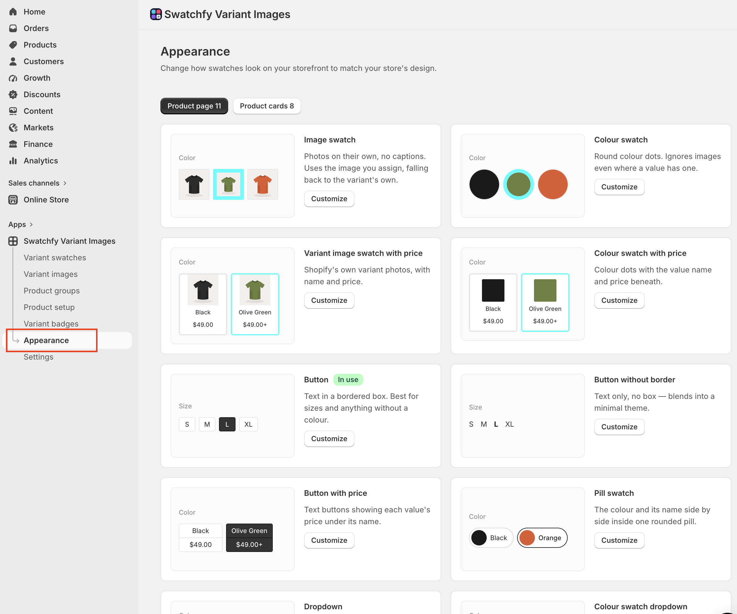
Open Swatchfy → Appearance. Everything here is visual only — it never changes which swatches appear or what they do.
This is the one thing worth understanding before you click anything.
Appearance is a gallery of looks — Colour swatch, Image swatch, Button, Pill swatch, the dropdowns. You style a look once, and every option using that look picks it up. If Colour and Material are both set to Image swatch, styling that look styles both.
The gallery has two tabs, Product page and Product cards, each with a count of how many looks are in use there. The same look is styled separately on the two surfaces, which is the point: a 44px circle that sits well beside an add-to-cart button is too heavy in a collection grid.
Each card in the gallery shows whether the look is In use and gives you Customize.
Section | What it covers |
Presets | Starting points. Pick one, then adjust — you are not locked to it. |
Swatch shape & size | Shape (circle, rounded, full rounded, square), size, border width for default and selected states, border and background colours, image fit (cover or contain), hover zoom |
Shape & layout | The box around a text swatch: corner shape, padding, minimum width, item width, height |
Text labels | The text under each swatch — font size, weight, case, alignment, colour, and whether it is full text or truncated |
Price | Only on looks that print prices. Colour, bold, and marking values whose prices differ |
Hide extra swatches | What happens when an option has more values than fit — carousel, compact counter, or a horizontal or vertical overflow, with a maximum visible count and a counter size and colour |
Overall size scales the whole look at once, which is usually a faster way in than setting each number.
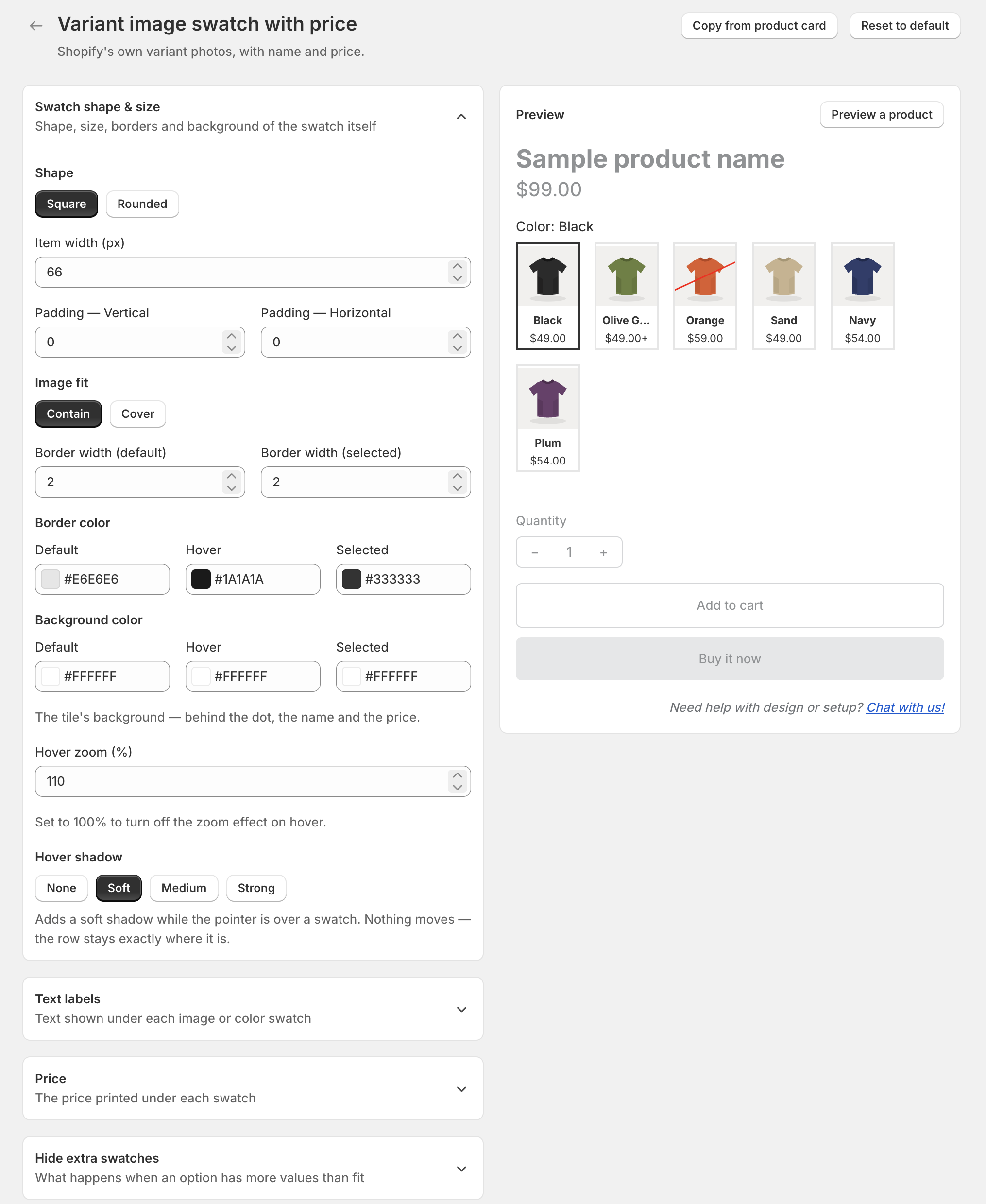
Copy from product page and Copy from product card bring the other surface's settings across for that look. Use one of these rather than typing the same numbers twice.
The preview beside the controls is a sketch, not your theme — it shows shape, size, order and spacing so you can judge a change quickly, but it does not use your theme's fonts, colours or layout. A difference between the preview and your storefront is not a bug.
Preview a product renders the look against one of your real products, which is closer. Check the storefront itself once the settings look right.
Reset to default puts the look back to how it shipped.
Some appearance-related settings are shop-wide rather than per look, so they live in Swatchfy → Settings:
Out-of-stock display — how a value that cannot be bought is shown
Tooltips — whether the value's name appears on hover
Option label settings — the "Color: Black" line above each row: hide the name, the value, the colon, or the whole label; its colour and font size
Swatch margins — spacing and alignment around the rows
Colour split direction — how a two-colour swatch divides
Custom CSS — for anything the controls do not cover
Upload swatch images at at least twice the size you display them — a 66px swatch wants an image 180px wide or more. Swatchfy already requests a larger version from Shopify for sharp screens, but it cannot add detail that was never in the file.